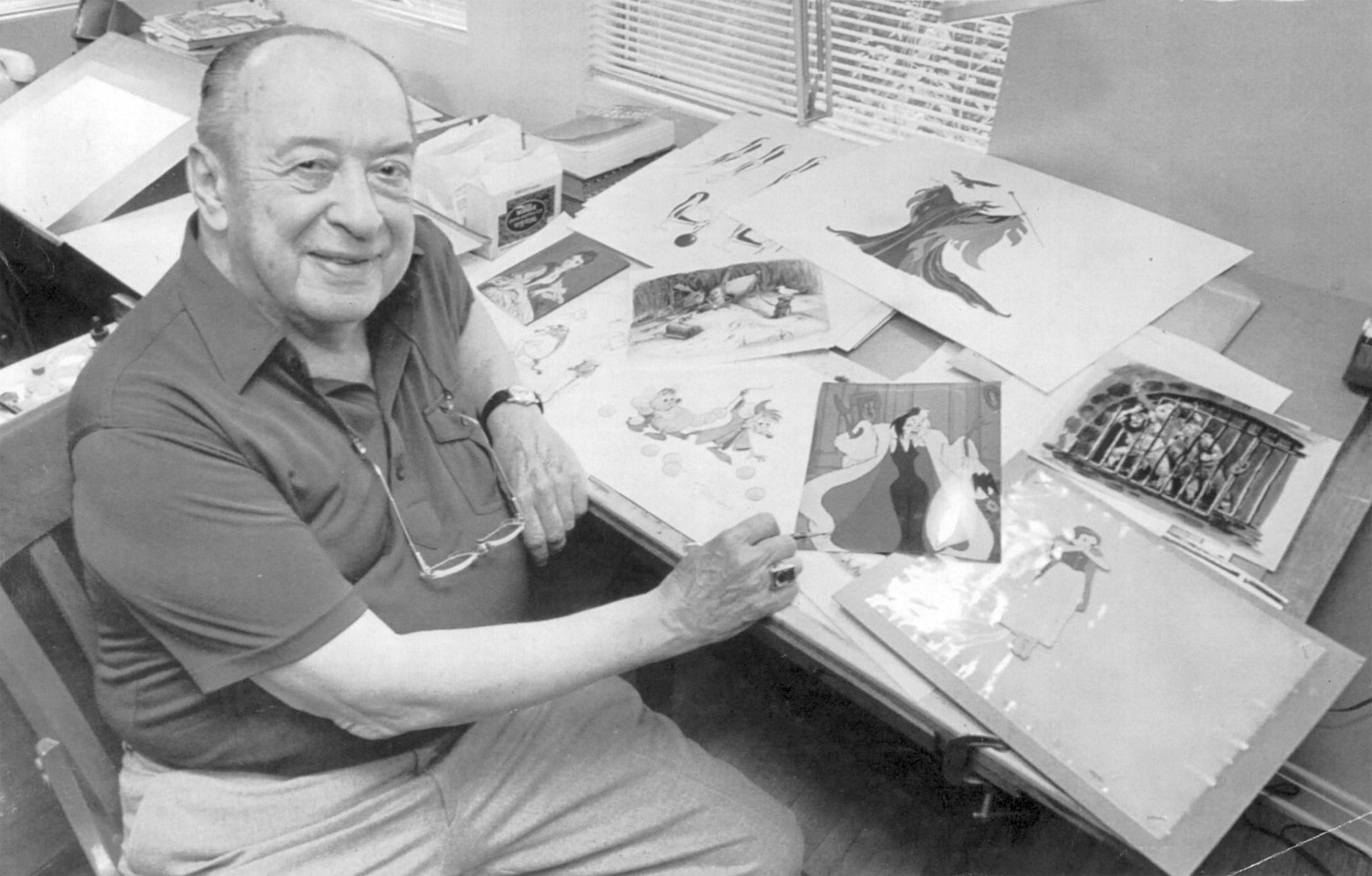
Thursday, May 16, 2013

Bernard & Bianca


What a challenge this must have been. How do you design interesting looking mice for a new Disney animated feature, produced  in the mid seventies?
Over the years animation studios had used an endless variety of mouse characters, so to come up with new concepts for these rodents wasn't easy.
Newcomer and story artist Fred Lucky had spent some time developing The Rescuers as an animated film, and these are some of his design suggestions.

They might not show a lot of appeal yet, but at least they are different.


For more info on Fred Lucky go to this link:

Here is a look at how Milt Kahl, Frank Thomas and Ollie Johnston approached these two characters.

Milt Kahl tried to incorporate some of Fred's ideas into his own design research.
Milt is definitely trying something new here, these sketches almost look like he drew them left handedly.


Proportions and volumes look  a bit more solid in these pages.


Just an awesome sketch, period!


Still a long nose, but chubbier than earlier versions. I do like this Bernard quite a bit.


The idea here is to treat the eyes like real mice, just large black dots.
It limits the range of expression somewhat, and tends to look kind of spooky.


Milt then applies what I call the Robin Hood formula, only the ears and the tail remind you that these are mice.


After the noses got shortened these versions were approved as final designs.


Frank Thomas explores early design concepts.


These pages show how Frank stages the situation in which Bernard and Bianca meet for the first time. Simple scribbles that reveal acting possibilities.


A few charming Thomas key drawings from an actual production scene.


Ollie Johnston tries out various proportions for anthropomorphic mice.


And this is his take based on Fred Lucky's sketches.


Then Ollie explores a concept that for some reason resembles Basil of Baker Street, a character that would make it to the screen quite a few years later.


Bianca in 1970ies outfits.


Ollie's chubby, long nosed version.


Again, these huge black pupils wouldn't have worked.


Bernard as he appears in the film. Beautiful solid sketches.


A rough production drawing.


It is interesting from a psychological point of view that people are freaking out when they see real mice, but ever since Mickey Mouse audiences don't seem to get enough of them when they are animated.

Tuesday, May 14, 2013

Three Tigers...


…by three different artists. 
The first one is by Heinrich Kley. I purchased it quite a few years ago during a visit to Munich.
My first impression of this piece was straight forward realism. But the more I studied it the more abstractions I found. Kley played strong horizontal, vertical and diagonal lines against each other. This is a very organized head study of the animal, volumes are simplified to a point where this almost becomes a caricature. I just love the design of the black stripes with its thick and thin lines.
There is a grid drawn over this oversized sketch, which almost certainly indicates that Kley did this as study for a large mural.

Fritz Hug's tiger also has a sketchy quality with typical splashes of paint going right over the image.
I like the fact that he corrects certain parts of the body, but you still see the original position of the rear leg, the elbow and the front left paw. A beautiful raw study, probably done at the zoo.


Liu Jiyou's illustration on rice paper was done at his studio.  Before painting he would come up with endless sketches in front of the animal until he felt confident enough to draw specific poses and compositions at home. The angle and perspective of the tiger's head is stunning.


Researching other artists' approaches to drawing and painting tigers has become part of my studies in preparation for my film "Mushka". 

Sunday, May 12, 2013

James Bodrero


                                                                                          ©LIFE

James Bodrero (in the center of the photo) could draw horses.
And Walt Disney knew this, that's why he asked Bodrero to storyboard large sections of the Pastoral sequence in Fantasia. All that interaction with Bacchus and the Centaurs is his work.
Not much later Bodrero was chosen to join Walt and El Groupo on a trip through several South American States to study and sketch local culture and folklore.
Not much sketching going on in the photo above, but he seems to be enjoying a dance lesson which is being filmed by Walt Disney himself.

A stunning character design sketch depicting a couple of centaurettes and a faun.
This casual situation reminds me of the work of Heinrich Kley.


These drawings made during the South American trip leave me somewhat speechless.
They seem effortless, and yet everything from anatomy to the characters' outfits is so well observed and put on paper with sheer joy. Some of my favorite Disney drawings  ever! These horses….oh boy!!


Animator Frank Thomas becomes a subject in this Bodrero sketch.


Bodrero left Disney in the mid fourties, he enjoyed traveling and particularly fell in love with Spain.
Him and his wife had residences in San Francisco as well as Andalusia on the Costa de Sol. 
In 1965 he published a book titled "Long Ride to Granada", a sort of travel log through the South of Spain. Here are a few beautiful illustrations from the book.


James Bodrero in his later years.
He passed away in San Francisco in 1980 at the age of 79.


Friday, May 10, 2013

Robin Hood & Little John in Drag


Milt Kahl sure likes a good challenge.
When Robin Hood and Little John are running to catch up with Prince John's coach, they also put on gipsy clothes at the same time to disguise themselves. The characters are having fun doing this, so the acting needs to reflect their attitude, combined with a run that keeps changing pace.
Milt tried to get as much comedy out of this situation as possible, especially in Little John's animation.
This kind of work requires an enormous amount of concentration and planning. 
Of course the end result looks flawless, natural and very entertaining. These scenes are great for frame by frame study. There is so much going on here, but everything reads clearly. The character weight, the clothes' overlapping action, the overall staging, just beautifully analyzed.

These are a couple of Milt's thumbnail pages, he is trying to figure out how Little John might put his hat away and replace it with a wig.


A model sheet made up of key drawings from a couple of scenes. I marked one drawing NG, it is out of order and belongs elsewhere in the scene.


Four original roughs that Milt discarded (followed by a few copies). This is what his first pass looked like.
As you can see the character remains in the center of the pages, running in place. 


Robin stops for a moment to take time to pull down his dress.
These drawings reflect a slightly older design version. Before the scene was sent over to be xeroxed, his neck was widened according to the final model's look.


The film Robin Hood might not be one of your favorites, but still…it is full of animation gems that are worth taking a closer look at.